
Last year I was fortunate enough to work on a wayfinding pilot for WMATA, the Washington DC Metro. They were looking at ways to make their signs and maps more user-friendly. Philadelphia just so happened to be doing the same thing, so we used SEPTA as a reference. While putting together resources for my forthcoming Philadelphia Track Map (“it will be done when it’s done”), I spent more time looking at the new SEPTA Metro map. I realized that for all the good work the team had done on wayfinding, the map seems to have been an afterthought. More likely, it was a user generated submission (similar to what the MBTA did years ago with their new map).
Old vs “New”
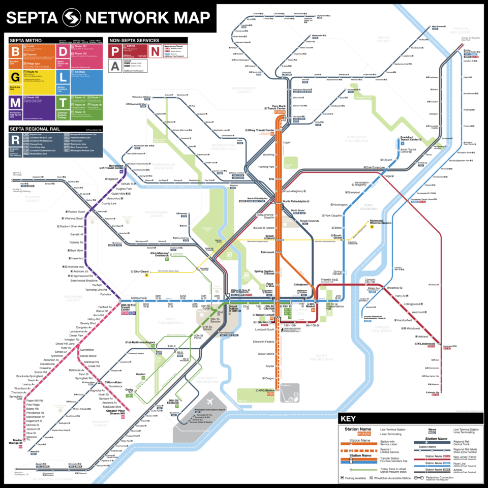
Like other northeastern transit agencies, the Southeastern Pennsylvania Transportation Authority, SEPTA, was cobbled together out of former private transit and rail companies in an effort to salvage passenger service in Philadelphia after the automobile took over. SEPTA is most similar to the MBTA with a mixture of legacy trolley lines that run both in a tunnel and on the street, light rail interurban lines, heavy rail subway/elevated lines, buses, and commuter rail. The complexity of these different services makes for a unique challenge for the cartographer.
The previous system map was your basic design, showing all the lines with not much information about service. The Broad St Line, for instance, has both express and local service, with a branch along Ridge Ave, as well as special express service to the last stop, NRG Station, where the local sports stadiums are located. None of this information is communicated on the old map. Some of the street-running trolley lines are shown, but their full routes and terminals were cut off with arrows pointing to nowhere. Because the regional rail network is shown at roughly the same scale as the metro, the map is overcrowded with station labels that make navigation difficult.
“SEPTA” is a bit of an unwieldy mouthful, so as part of the wayfinding project, the subways and light rail lines have been rebranded with new lettered routes as part of the new “Metro” identity. The new map refocuses on the Metro, enlarging the transit lines over the regional rail system. The new map has four specific changes:
- Each service is shown as an individual line. This is taken from the Vignelli school of transit map design so that the user can follow each service from beginning to end.
- Street-running service is shown in its entirety. This shows the full reach of the network.
- Bus lines which run 15 min or more frequent service have been added.
- Regional rail has been included, but has been visually reduced so that it no longer dominates the map.
While the new map is certainly an improvement, it still leaves a lot to be desired. So I thought, why not figure out what I don’t like about it, and do one better.
Design Choices
All modern transit maps owe their existence to Harry Beck. Beck was a draftsman in London who, in 1931, redrew the map of the London Underground from a geographic design to a diagrammatic design. A geographic map is fine, but when stations are spaced close together they often become hard to read. Where lines spread out into suburban areas, large areas of the map would remain blank. With a diagram, geography is distorted so that the necessary information is clearer; areas that have many stations are often more spread out for clarity and areas with larger distances between lines are condensed. Virtually all transit maps today are, in fact, diagrams and not maps.
Therefore, when making the shift from geographic to diagrammatic, one must think about what is the most important information to show the user, without distorting the map so much that a rider would have a hard time navigating the system. Transit maps are very simple creations. There are really only three parts: lines, stations, and labels. Much like how punk music showed how much you could do with only three chords, a transit map uses style to differentiate elements to communicate to the user what they need to know.
Line Hierarchy

The transit line itself is the main element. The entire point is to show a user where they can go along a certain line, and where they can go from there if they were to transfer to another line. However, transit networks are rarely ever made up of only one kind of service (in many small US cities, this is often the case, but not in larger ones which require maps like this). This requires us to create a hierarchy of line design choices to show both the different services, but also what those services provide. Color is the main factor, but so too is line weight, size, and solid-or-dashed.
The overall rebranding of SEPTA as Metro aimed to differentiate their variety of services. The idea was to highlight the changes which the brand created, namely the updated colors, route names and line labels. By showing the Metro in a clearer, easier to understand way, the hope was that riders would have an easier time using the system. Instead of showing each line in the same way, the emphasis is now on the Metro first, and other services second. The Metro lines are brightly colored, and have the heaviest weight of the services.
Philly has three basic rail line types: metro (subway/elevated), light rail (either on a dedicated right-of-way or street-running), and long-distance rail (regional rail, commuter rail to NJ, or national Amtrak). Each type of rail provides a different type of service. For instance, one of the main differences between a metro and commuter rail line is frequency. Metro lines typically provide service every 5–15 minutes throughout the day, while commuter rail lines usually run every 20–60 minutes. Not to mention, both usually have different fare structures and cost. Therefore, if we were to show both services in the same way, it would subconsciously communicate to the user that they are equal.
Typically, subway maps will show a commuter or regional rail network as well, but will try to de-emphasize the lines so that the reader almost has to already know they are there. This is found in the designs of the Boston and New York City systems, which treat their commuter networks like second class citizens. Traditionally, the SEPTA map drew the regional rail and subways in similar ways (usually line weight). Even with the previous map, which used different line weights for the subways and regional rail, the regional rail network we still prominent. This speaks to the SEPTA governance, which more often lives in the suburbs rather than within the city itself.
Philly was the first, and so far only, city in the US to merge its legacy commuter rail networks into a single regional rail network. Commuter rail is what most Americans know of, which is where heavy rail lines run from the suburbs (or some exurban town) into a central train terminal, usually in a downtown; service is designed around 9a-5p commuters and usually runs ever 20-60 minutes. Regional rail, which is seen in Europe and some parts of Asia, and has all lines run through a central (or multiple) trunks, so that all service runs through the central city rather than terminating there. While the branches often still run at 20-60 minute service, the combined service through the trunk is often 5-15 minute, similar to that of a metro.
SEPTA, therefore, needed to show the regional rail branches, which had less service, and the central trunk, which had more service. To do this, the new map chose to make all Metro lines the same weight, and downgrade the regional rail. Regional rail branches are drawn with very thin lines, while the central trunk is drawn slightly thicker, but still not as thick as the Metro. This is an unfortunate choice, since regional rail makes up a large proportion of the SEPTA network. The different size of the branches versus the trunk is also one which works on paper, but it executed poorly. The trunk should be closer, if not the same, as the Metro lines, given the similar levels of service both offer.
Worse, non-SEPTA service is shown with very small, dashed lines. Typically, a dashed line on a transit map means limited (part-time or sporadic) service. This is the case elsewhere on this map showing the B2 express service to NRG Station, as well as the T3 streetcar line service to Darby Transit Center (oddly, it does not also show this for the B3 service north of Olney Transit Center, which is also sporadic). Showing NJT and Amtrak service this way is confusing and insulting (which I wouldn’t put past Philly to do intentionally).
What stands out to me about this map is just how narrow the lines are. Older US transit maps often use strong, thick lines that grab the eye. I have no idea why the original author of the SEPTA map chose to go with such narrow lines. I get the feeling that they were inspired more from European transit maps, which go with narrower lines due to necessity. European cities tend to have far more tram, metro, and rail lines to show, so the map must use smaller lines to fit everything in. Unfortunately, we don’t have this problem in American cities.
Street running
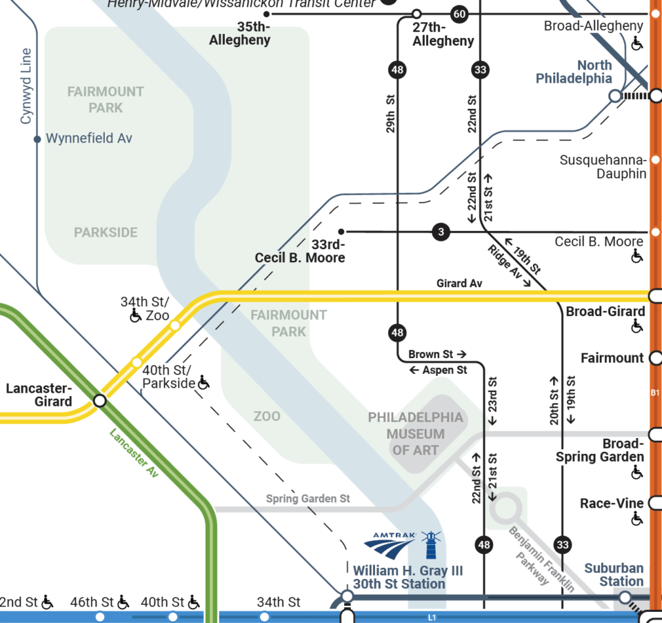
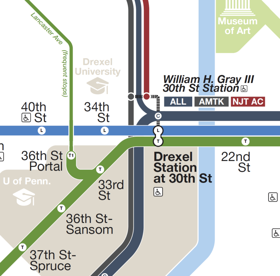
Like Boston and San Francisco, Philly still has a legacy streetcar network. When the Market St subway was built, it had two tracks for heavy rail and two for streetcars, which would loop back at 13th and Market. The streetcars acted as local service, while the heavy rail was express (though this is only the case between 30th St and City Hall). The streetcar subway has two portals in West Philly, and serves five lines. Additionally, there is the Girard Ave Line (Route 15), which runs north of City Center and does not enter the subway, but acts as an important crosstown line.
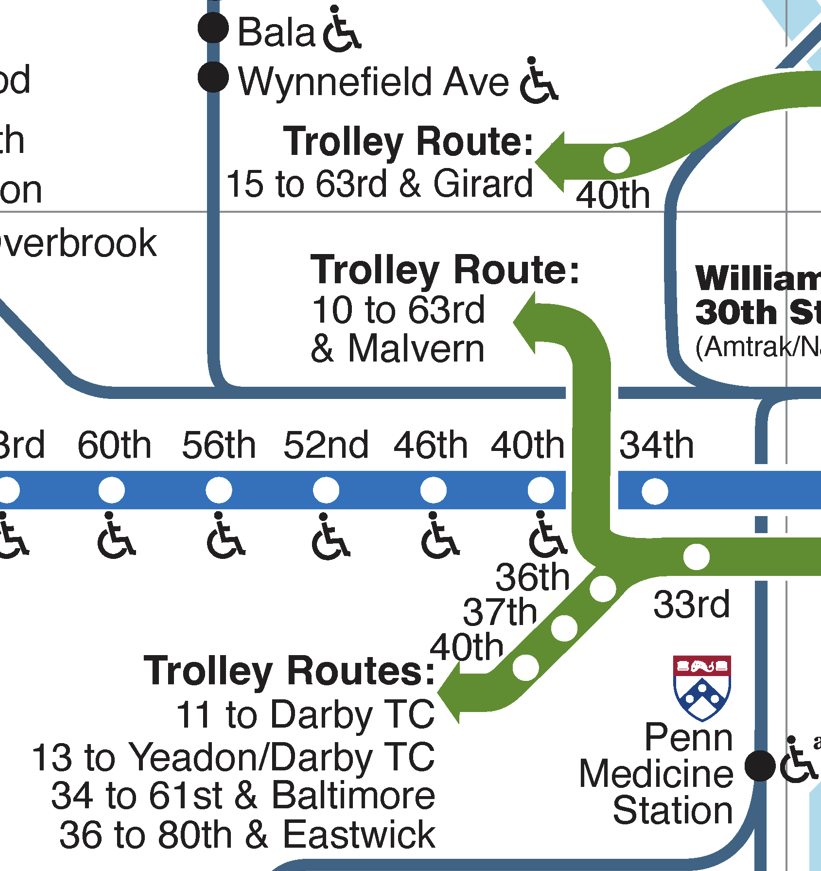
Previous SEPTA maps didn’t know what to do with these lines. The subway was easy enough to show, but once the cars leave the tunnel they act just like buses, stopping every block or so. Showing every single stop, at least on the subway map, would be too much and too hard to read. Previous maps often showed the lines as arrows when they left the subway, or in the case of Route 15, just a colored line between two arrows showing only the stops where riders could transfer to the subway. None of this is helpful.
The new SEPTA map rightfully elevates the streetcar lines into the Metro brand, renaming the non-sequential route numbers with T1-T5, while Route 15 is simply renamed to G1 (though, this should be simplified to just “G” since there are no other services on the line). This is good branding, but the visual hierarchy is odd. Street running, where stops are often every block, and subways, where stops are often blocks apart, need to be shown differently. Otherwise, when there are no stops shown on the street running sections, it appears that trains run express from their terminal to the subway.
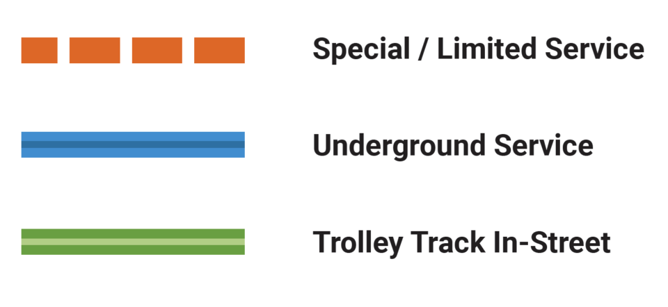
The new SEPTA map tries to address this by adding an additional element to each Metro line to differentiate the type of track structure. Trains which are running inside a tunnel are shown with a more narrow, darker line running down the center of the main line element. When tracks are elevated, or above ground on some kind of structure, they only have the main line color with no added element. When running on the street, they have a narrow, white line running down the center.
On paper, this seems like an interesting solution. But in reality, it adds information that really isn’t important (tunnel vs elevated), and visually adds clutter. The nested line design almost gives the map a pattern to it, similar to corduroy, which is more distracting than helpful. Literally, the only instance where this difference is needed is when lines are street running, because you need to give the user a visual clue to say that the various stops are, in fact, NOT shown, but they are there.
Showing Service Patterns
By itself, this may not have been much of an issue. But the new map has chosen to use the Vignelli school of thought: each service has its own line from start to end. The average metro line around the world only has one service per line, so this more complex depiction isn’t needed. The New York subway is in a class unto itself in terms of service complexity, and the Vignelli model was designed well for it. Philly is one of the few cities that has a 4-track trunk subway with both local and express service, so it is in the unique position to borrow from the Vignelli map.
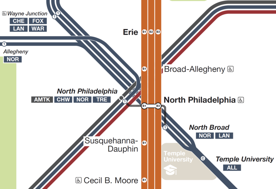
The Broad St Line has three levels of service, the B1 local (from Fern Rock to NRG), the B2 express (Fern Rock to Walnut-Locust, but extended non-stop to NRG for special events), and the B3 Ridge St Spur (Olney Transit Center to 8th-Market St). A small fly in the ointment when it comes to showing each service is at North Broad St, where B3 trains make the stop, but B2 trains skip. I bring this up because it means that both express services must be shown independently, rather than truncated, to show this one stop.
In the past, the Market-Frankford Line ran with an A-B style skip-stop pattern that would have been changed to L1 and L2 for the Metro rebrand. But service simplification was also part of the task, so today Metro is only using L1 (which should be simplified to just “L”). The aforementioned streetcars are using T1-T5, which is smart. But the map copies the Vignelli model for the streetcar subway as well, which I find to be more trouble than it’s worth.
Five services, all shown with the same weight, combining into one giant green line, creates a very distracting element on the map. Combined with the nested dark line, instead of creating an easy-to-read transit line, the map just has this bizarre patterned blob in the middle. Worse, this forces the map to create new, larger stop bubbles, which is distracting. While the Vignelli model preaches that each service should be its own line, it also preaches “no dot, no stop”. Here, we have large pill shaped bubbles that cross all lines. While these types of station dots aren’t new, they only create more visual data that the user needs to unpack.
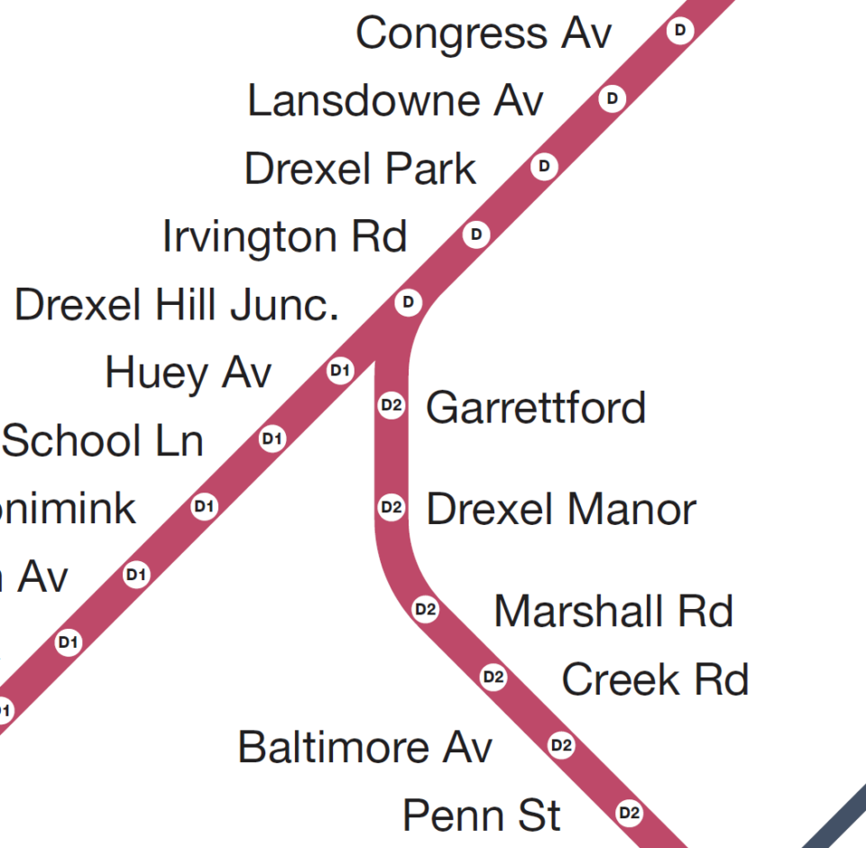
The same thing is found on the former Route 101 and 102 Lines, now the D1 and D2. These former interurban light rail lines, which serve the suburbs of Media and Sharon Hill, connecting riders to the last stop of the Market-Frankford Line. Both branches truncate between 69th St and Drexel Hill Junction, and the map clearly shows two individual lines with the pill-shaped station dots. But at 69th St, the map chooses to truncate both lines into a single line for JUST the last stop.
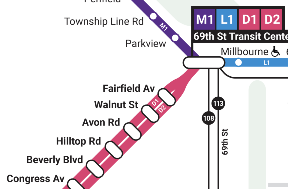
We need to take a step back and think about when it’s right to show every line, and when truncating lines makes sense. For the Broad St Line, where each service is different, it’s important to show each line separately. But for the streetcar subway, and the D Lines, each line makes every stop (except for the T1 line, which branches off at 36th St). To me, showing each line separately is less helpful, since it ends up showing the user MORE information than they need. If each branch is going to make the same stop, then they are all basically ONE line at that point.
This is an issue that is solved with the single line for the Center City regional rail tunnel. If this map was to commit to the Vignelli model, then each regional rail service would also be shown as their own line. The main reason this map doesn’t do this is that SEPTA doesn’t always run single end-to-end pairs. Rather, while most lines do truncate through Center City, they often end up running to different branches when they leave the trunk. This wasn’t supposed to be the case, as the original regional rail system had strict branch pairings, and even a route number system from R1 to R8. Presumably, this was changed to better address demand, and to save money from running empty trains further than they needed.
Buses
Besides the emphasis on the new Metro brand, the biggest difference with this map versus older maps is the addition of bus routes. Not every bus route is, or even could be, shown. Rather, SEPTA has chosen to show routes which run, on average, better than 15 minutes at peak times. As far as I can tell, the only other US that shows bus routes like this on their subway map is Boston. This shouldn’t be confused with full system maps which show all bus and rail lines, of which I think SEPTA already has some good examples.
The goal here is to show the greater reach of transit in a city. Too often, people will look at just a subway map and see large blank areas, not realizing that there actually is transit in the form of buses. As many cities offer free transfers between buses and subways, this masks how far a transit fare can actually take you.
The problem is in the nature of what a map needs to be. A map, or more accurately a cartographic diagram, is a tool to direct the user through a system. One look at a geographic map shows why we need these in the first place; if we were to show everything, it would be too hard to use. The solution has been to distort and simplify geography so that the main elements (here, the Metro rail lines) are most clearly read.
This is fine for rail, which usually spans enough distance that ones sense of geography is already distorted (that is to say, if you are traveling underground for a few miles, you aren’t really seeing the geography of the city). Buses, on the other hand, are often hyper-local transit. The routes are predicated on local roads, with stops ever couple of blocks. The bus rider often uses the geography of the city to tell when their stop is coming up (e.g. knowing your stop by seeing a familiar store).
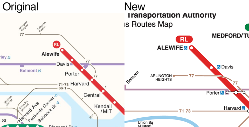
This is not something that translates well to simplified cartographic diagrams. In fact, it renders the bus lines useless as you can’t really know where they are going and where the stops are. Worse, in some cases, the bus lines need to be so distorted that they end up literally incorrect relative to the larger system. This is painfully apparent on the MBTA map where the 77 bus, which runs from Harvard Sq to Arlington Heights, is drawn SOUTH of the Red Line. If you can’t show me where a bus line is taking me, then there is no point in showing the line on the map.
Only routes with frequent service are shown. On paper that makes sense, but in practice many routes often split service at one end so that after a certain point the branches no longer fit this requirement. On the new SEPTA map, this is solved by adding an arrow and saying the line continues somewhere. But their destination point is never shown! This is the exact issue that the streetcars had in the previous maps. So not only does the rider not know where they need to be to transfer to the bus, they don’t know where these bus lines end up.
At best, adding bus lines shows the user where they can transfer to continue their trip. This IS worthy information to have. But this can be done with simple tags under the station labels, or on strip maps of single lines that offer more space for transfer information. I’d argue that the average bus rider already knows which routes to take to get where they are going, or to the nearest Metro station. With smart phone apps like Apple/Google Maps or Citymapper, you are drawn an individual transit map for your journey, so showing the bus lines on the Metro map doesn’t tell the user anything they can’t already find out. Not to mention, using Google Maps gives you the ability to zoom into the street grid to see exactly which bus stop you need. This could never be done on the system map.
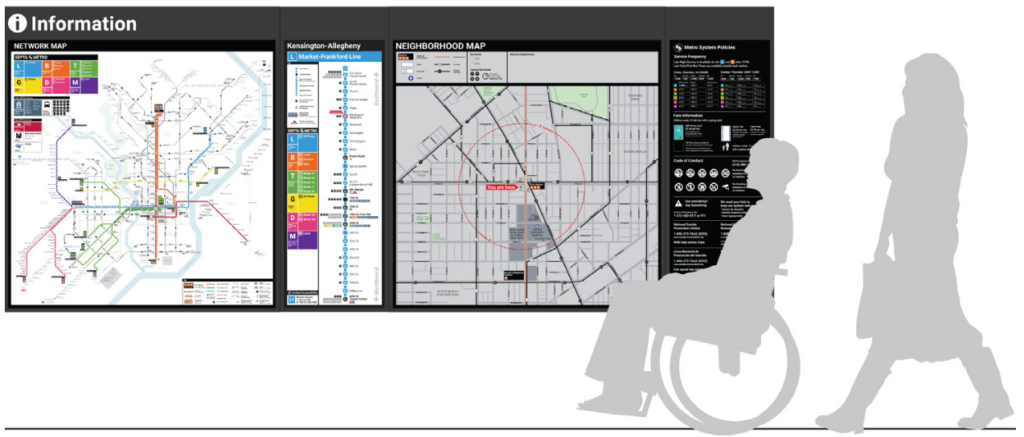
At each Metro station, there needs to be three maps: one of the Metro, one of the bus network centering on the station you are at, and a local geographic map showing a roughly 1-mile radius, with local bus stops. To their credit, it does appear that SEPTA is experimenting with the 1-mile maps as part of their pilot. There is no way to effectively combine these maps if they are static and printed. This was the initial intent of Massimo Vignelli when he made the infamous 1970s MTA subway map, but the MTA chose to save on printing costs and only use the system map.
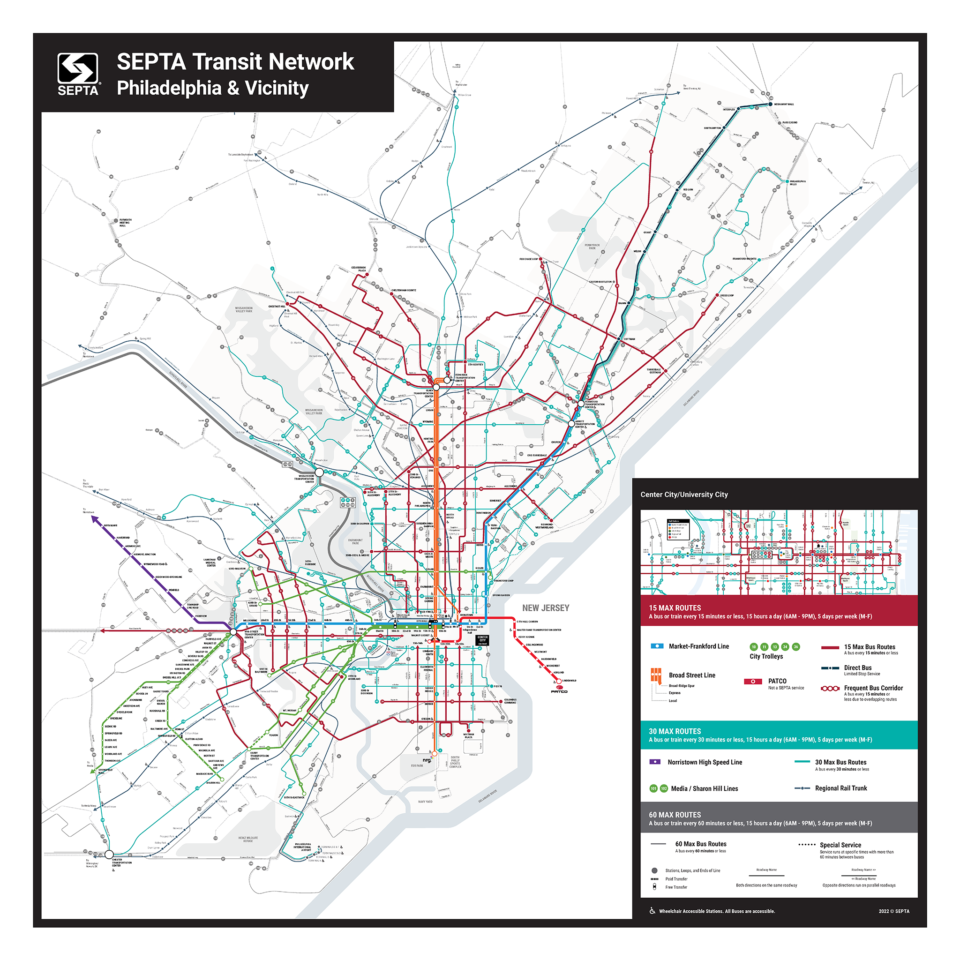
SEPTA does have a bus network map that seems to have been designed by someone different than the Metro map. Even with removing many geographic elements like streets, this map does a far better job at more clearly communicating bus lines and service levels. Oddly, the left hand side seems to be unfinished, with many lines just ending in arrows. This may have simply been a prototype released for feedback. This wouldn’t work on a Metro train, but it would be very helpful at stations.
This is why I cringe when I see buses on subway maps. I fully understand why transit agencies want to promote the use of buses in travel. But the issues riders have with buses have more to do with the actual service and being stuck in traffic rather than not seeing them on a transit map. Worse, it is a quiet admission that their interest in better wayfinding for the rider only goes so far. I say, unless there are BRT or special bus lines (like those to the airport), do not show them on your rail map. Showing bus lines will never be effective or clear, and end up making the rail aspect of the map even harder to understand.
Symbols
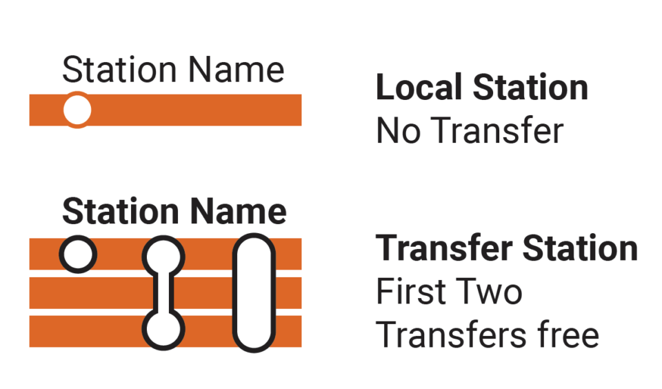
While one might think that a stop is simply a dot on the map, in truth a station symbol can communicate more information than simply where a station is. It’s hard to mess this up, and the new SEPTA map does this OK. But there are some choices which I don’t agree with.
On the new map, stops are shown in a variety of ways. The fact that there are so many different symbols to indicate a station is more of the issue than what the symbols look like. For instance, the Broad St Line uses five different symbols for a station depending on if it’s a local, express, transfer, or what ever the hell is going on at City Hall (Instagram?)
Because of the multi-line design of the Broad St and streetcar subway lines, an elongated pill shape is used. While this certainly does convey that all lines stop at a particular station, the different shapes are more confusing than if each line had a simple dot (no dot-no stop). Visually, this simplifies what the user has to translate.
Better yet, having a single dot means that something can be placed within that dot that gives the user more information. All people don’t understand wayfinding in the same way. Some people like detailed directions (go 1 mile down X Rd and make a right turn at Y Blvd). Others rely more on descriptions (go down until you see the McDonald’s and make a right). Neither is wrong, but when designing a wayfinding map, a designer must understand these differences and try to incorporate information for both types of people.
For instance, while the new map splits up the Broad St Line into three distinct services, it doesn’t do a good job in labeling each line. Yes, there is a small “B1”, “B2”, and “B3” on top of the lines themselves placed along the route, but this means that if you are getting on at a station that doesn’t happen to have one of these labels, your eye must wander along the line to find it. This is an additional action that can cause confusion and add time. Better to have a label at each station to show which trains stop there, so the user can instantly know.
The terminals are the only stations where the new route label icons are used, which is fine given the visual clutter they would add if more were shown. But I’m not a huge fan of the black boxes used to highlight the terminals. This might be better implemented if there was other info, such as a list of connecting bus routes.
The use of different symbols for regional rail stations is smart, but I don’t see why NJT stops need to have a third design. The regional rail lines are at least labeled with text above the lines, but these can easily be lost given that the station labels are of a very similar size and weight. But there is so much more that could be communicated on for the regional rail lines that it makes me wonder if the person who made this really knows Philly.
While the Metro stations clearly show which stops are wheelchair accessible, it’s strange that the regional rail stations leave this out. Many regional rail stations include parking for commuters, so leaving this information out is also strange. For that matter, some Norristown High Speed Line (now the M) stations include parking as well, which is again missing.
Labels
I don’t think it will come as a surprise to anyone who has followed my work that I love Helvetica. I know there are plenty of people who are sick of it, but when it comes to a transit map, you really do want a very clear and easy to read sans-serif font like Helvetica. I’ve used it so much that when I see a map that doesn’t use Helvetica, it’s immediately noticeable to me. The new SEPTA map uses a font similar to Helvetica (which font in particular I have not been able to pinpoint, so if anyone knows please leave a comment), but the small differences are so obvious to me that I actually get an uneasy feeling when I use the map. This, I admit, is a person preference.
A big problem with the new SEPTA map is that the station labels are too small. This is because of the addition of bus lines, which crowd out the map. By removing those lines, we have more white space to fill up with actually useful information. Showing the bus lines also requires local streets to be labeled, which just adds to the clutter.
Local Metro stations use a lighter font weight than express/transfer stops. But the street labels use the same weight as express/transfers, just smaller, which is a problem. The regional rail stop labels are very similar to the local Metro station labels. In general, there is just too much going on.
Geography
Massimo Vignelli famously thought that all geographic elements should be removed from a transit map, showing only the lines. This ideological purity of design ignores the need for the user to orient themselves to the greater map. A few geographic elements are therefore required to do this. While major parks were shoehorned into the 1970s MTA map, a more elegant design is the Lance Wyman WMATA map, which shows the National Mall and major parks. Additionally, Wyman used iconography to show the most important tourist sites in DC. While the new SEPTA map has clearly taken inspiration from Wyman, I think it could go a little further.
The map does do a good job of showing just enough underlying geography to help the user orient themselves. Even distorted, the geographic elements are important. Philly is defined by the Delaware and Schuylkill Rivers. This map also includes major parks, like Fairmount Park, as well as the Ben Franklin Parkway and Philadelphia Museum of Art. At the southern end of the city, FDR Park and the stadium sports complex (which are accessible by Metro) are shown, which is helpful for out-of-towners heading to games or concerts.
My SEPTA
Before setting out to design my own map, I did some digging to see what other maps were out there. It appears that the new SEPTA map came out of a kind of online charette, where either SEPTA or some uncredited designers created different versions of the map. Each one has elements I like and dislike, but they all seem to have strong European influences rather than American. Additionally, I found this map by designer Peter Dovak. This is very clean, but tries to pack too much into too small of a space.
In reimagining the SEPTA map, I wanted to let the actual transit lines stand out. Given that this is part of a new brand roll out, the Metro lines still needed to be front and center. But the regional, New Jersey, and Amtrak rail lines also needed to be better represented. Bus lines are gone. I also wanted to give the geography a bit more detail, so that visitors to Philly could quickly identify the major attractions. Finally, I wanted to see how much more information could be included with symbols without overloading the reader.
Lines
Using a hierarchy of line weight, I’ve made the Metro lines are the largest. The Broad St and Market-Franford Lines create a satisfying cardinal axis in the center of the map that everything else will build off. All lines that are non-street running are shown at the same weight. So too is the regional rail trunk line from Penn Medicine to Temple University. This is a visual cue to suggest that these are the lines with the highest frequency.
For the regional rail branches, as well as Amtrak and NJT, I use a narrower line. This indicates both lower levels of service, as well as differentiating these lines from those of the Metro. Initially I had Amtrak and NJT lines in white, with a colored outline as a way to differentiate them from SEPTA service. But user testing showed that it made the lines harder to read.
At Penn Medicine and Temple, I’ve drawn the regional rail branches so that the trunk splits into more narrow shoots. This is more dramatic at Temple, where the trunk splits into three branches. This is done to account for the different services that stop along the line. SEPTA considers their central trunk to continue north to Glenside, but in truth, different branches make different stops between Temple and Glenside, so the Vignelli approach was taken.
Finally, the smallest lines are saved for the street running trolleys. Similar to the regional rail, I’ve drawn the individual streetcar lines peeling off of the main trunk. The narrow line indicates that there are frequent stops not shown. The same weight is used for the G Line, which is an independent streetcar line.
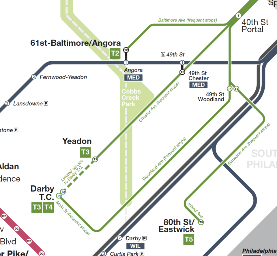
I’ve used a hybrid Vignelli design to discern different services. The Broad St Line lends itself well to fully separated lines showing locals, express, and spur trains. But as I discussed before, I don’t think this is necessary for the streetcar subway lines, which would only take up space needlessly. Here, I’ve gone back to a more traditional depiction of showing all lines truncating into one. I’ve made the branches more narrow so that the user knows that a change has occurred. If each one of these lines makes the same stops along the trunk, there is no need to separate them visually. I’ve taken the same approach to the Media/Sharron Hill D Lines, as the two branches make all the same stops from where they begin at 69th St to where they split at Drexel Junction.
The more astute SEPTA riders will rightfully point out that there are a couple of street running sections on both D branches, and ask why I’ve not shown them in the same way as the streetcar lines. I did experiment with this a bit, but found it confusing. The narrow lines for the streetcars are there to communicate that there are stops that are not being shown. The D branches are able to show all stops, and if I was to remove the few that are on the street running sections, it would feel as if there were no actual stops along them. Since the D branches exist unto themselves (that is, they don’t truncate into a subway), it is clearer to simply show all stations.
The only place where the hybrid approach gets wacky is on the regional rail, though I discussed why I make this choice. Even if the regional rail had fixed branch pairs, I think that showing all 7 or 8 branches running through Center City would be a worse solution. Like the European maps I referenced, a map showing each and every rail service (Metro and regional) would end up with a giant block of lines in the center of the map, obscuring any geographic elements, and forcing other lines to warp around them.
Symbols and Labels
First and foremost, Helvetica all the way. I’ve opted for Helvetica Neue as a way to better connect this map to the masters like Wyman and Vignelli. Again, this is a personal preference, but the use of Helvetica really does give a map more authority and professionalism.
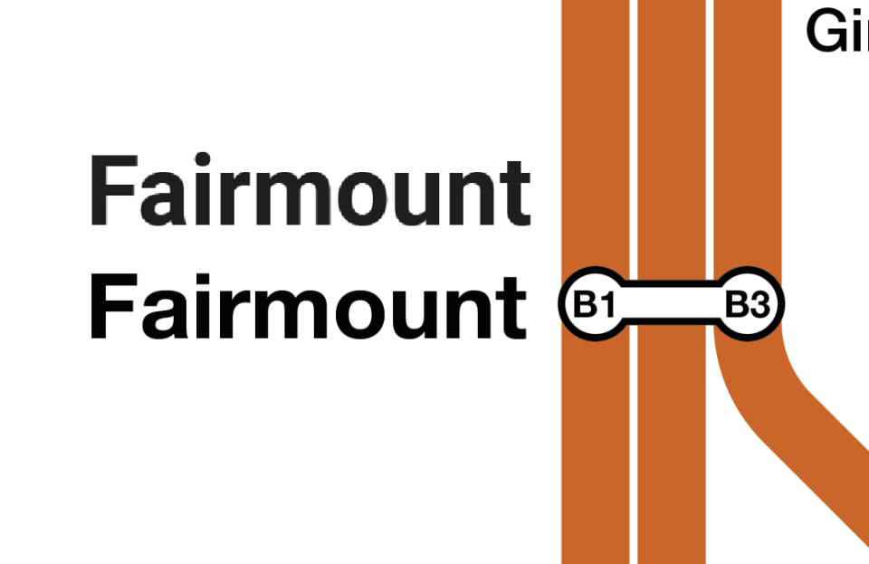
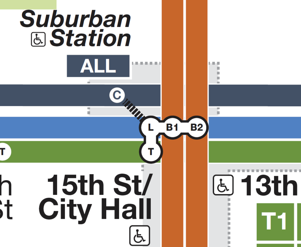
As stated above, I felt like there was a missed opportunity to use station dot symbols better for this map. To begin with, all stations have one design per service. All Metro stations have a large white circle with a letter in the center denoting the service. At transfer stations, the circles have black outlines and a white band connects each dot, but the dots are still the same design.
The service labels are, admittedly, not always as clear as I’d like them to be. The Broad St Line shows the need for these labels well, as each dot has a different B# to differentiate. However, when I truncate the D and T branches, I can’t fit each branch into the dot, so I’ve opted to truncate the label as well. Logically, this makes sense. I just hope that the average user will understand.
The new Metro service labels (letters in a colored box) are really nice, and in keeping with the current design, I only use them at terminal stations. I experimented with having them at each stop, but found having the label within the station dot more elegant and less cluttered.
Regional rail stations are similar, though they are smaller. There is a dark blue outline, and there is a number at the center which denotes in which fare zone each station is located. I knew that I couldn’t fit in the service label in the same way as the Metro stations have, so this is the next most important piece of information to have. SEPTA uses 6 fare zones, “C” for the central trunk, “1”-”4” radiating out from the trunk, and “J” for New Jersey.
Fare zones are something all US commuter rail systems have, and many metros around the world. But to show them on a map gets tricky. The London Underground is the best example of this, and the large fare zone blobs that dominate the map give it an unwanted psychedelic quality. By having the zone numbers within the station dots, I can show the same information in a more elegant way.
It seems that the Metro brand that SEPTA is experimenting with only applies to the subway and streetcar lines, not the regional rail. I really like the clean design of the Metro, so I’ve experimented with creating similar labels for the regional rail. Single letter boxes weren’t going to be enough, and double letter boxes worked at terminals. But if I wasn’t going to label the services at each station, I needed to design a label box that could accommodate three letters, and would be smaller so that I could use multiple boxes at stations.
Because of the complex nature of regional rail service, I couldn’t have every label at ever station. I chose to label each transfer/multi-service station, as well as the first and last stops on each branch. For the central trunk, where all trains stop, I use a label box that simply reads “ALL”. Again, there is logic here that I hope makes sense.
Finally, Amtrak and NJT stations are drawn at the same size as regional rail, but their design is inverted; A solid color disc in the center with a white outline. The inverted dot is a call back to the original design I had of the lines, but also one which contrasts with the regional rail dot so that the user understands this is a different service entirely (rather than an express service). The original map uses the official “PATCO”, “NJT” and “Amtrak” logos. I’ve chosen not to use them, opting for labels that mirror the regional rail text boxes. I would imagine that if I was making an official map, I’d use the logos as well.
I’ve kept the street labels along the Metro lines, which use their respective line’s color. That was a nice touch in the original map.
The last new symbol I’ve introduced is the “P” for parking lots at various stations. Given that so much of the regional rail, and many of the Norristown High Speed Line stations include parking, I feel like leaving these out was an oversight. This may be due to the original author not being from Philly, therefore not understanding the importance of parking, or because SEPTA really wanted to shift focus to the Metro. Either way, it’s too important to have and too easy to add back in.
Geography
Having worked with the WMATA map, I grew to love the subtle geographic choices and iconography that Lance Wyman created. Despite what Massimo Vignelli thought, geography is required to orient one’s self within your diagram. Much like the Potomac River and National Mall in Washington, D.C., Philly can be defined by the Delaware River and Fairmount Park.
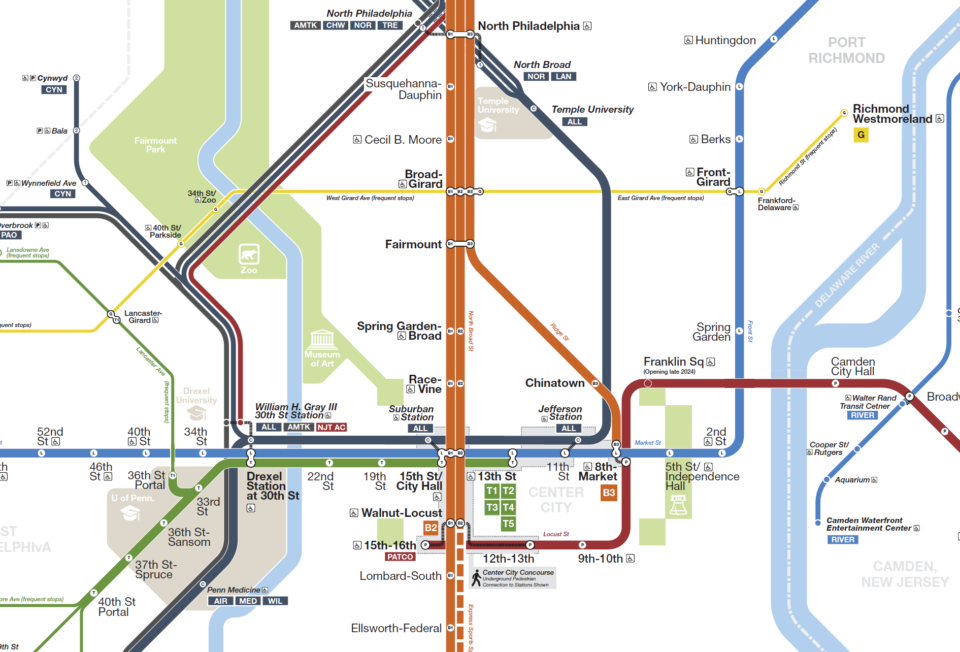
I’ve never lived in Philly, but I’ve visited enough times to know how an outsider thinks about the city. Googling various tourists destinations, you can get a good understanding of where someone might be using this map to go. Philly was initially designed around large urban squares (Logan, Rittenhouse, Washington and Franklin), and these are shown. Next to Washington Sq I’ve added an icon of the Liberty Bell, and up the way from Logan Sq I’ve added the Philadelphia Museum of Art.
I’ve opted to include a few more parks and locations as well, as I feel like they help define the borders of the city, and are places people would want to take transit to. These include the Airport, FDR Park, the stadium complex at NRG station (which I’ve embellished with sports balls), and smaller parks. Given their importance to the city, I’ve also included large colleges and universities. Some of the smaller ones, like Drexel and Villanova, are simply labeled. But the University of Pennsylvania and Temple University take up so much real estate (and multiple transit stops), that I felt it important to give them their own space.
While I could have gone on a deep dive and tried to label each neighborhood, I felt it better to stick to the basics. Philly has a unique shape which allows larger areas (South Philly or Northeast Philly) to stand in for smaller neighborhoods. It was important to differentiate the city from the surrounding counties, especially when the new Metro naming convention has used them for inspiration. The Norristown High Speed Line has been renamed the “M” as it goes to Montgomery County, while the Media and Sharron Hill Lines (previously 101 and 102 respectively) are renamed the “D” lines as they go to Delaware County.
These labels are also required as SEPTA serves not only Pennsylvania, but also reaches into New Jersey and Delaware. As a little easter egg to the map nerds out there, I’ve made the Pennsylvania-Delaware border an arch, mirroring the actual border.
Key
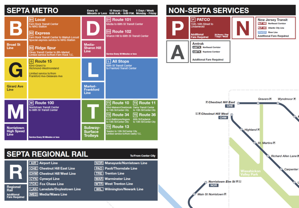
The last part of the map, which I hadn’t covered before, is the key. The key comprises of a service guide in the top left, and a description of the elements in the bottom right. I’ve redrawn the elements key to reflect my changes to the design, but I honestly love the service guide. I am one of the few people who owned a Windows Phone back in 2013. To this day, that phone had the greatest user interface of any phone I’ve ever used. It’s a shame that Microsoft chose to torpedo the entire project. But the new service guide lets that design live on. My one issue with the guide is that there isn’t enough information about each service, so I’ve added this in.
Conclusion

To be clear, I did not set out to design the perfect map. So much about design is subjective. Even more important is how a map like this works in the real world. This is very much a draft that would need play testing with the public to know what elements work and which ones don’t. The goal here was to walk you, the reader, through how I think about a map like this, why I like some elements and why others don’t work.
Making service maps was how I first got into cartography in the first place, and it’s been a long time since I’ve sat down to redesign an entire map. I see service maps like this all over the internet, and I see a lot of new designers and railfans try their hands at drawing them. So this is more of a guide for them. Having done this now for 20 years, I am consistently impressed with the quality of work that is coming out these days as vector based design software becomes cheaper and more accessible.
Service maps are some of the most recognizable elements of any transit system. Yet, they always seem to be an afterthought for many agencies that have limited resources. Wayfinding has many parts, and the map is just one of them. But trying to stick as much information into one map to save on printing is not the way to go. In the age of digital wayfinding apps, much of the weight has been lifted off the shoulders of cartographers because dynamic digital maps can guide riders at all different levels.
Maps are not just simple tools. They are also visual representations of a city. There may be more people around the world that know the NYC subway map better than an actual map of the city. The line between both will always be gray and open-ended, but that’s where we as designers can have the most fun.
One thing that jumps out at me is that the grayish blue used for the regional rail and dark gray used long-distance rail services are too close together. This makes it harder to tell at a glance which service labels apply, particularly in places like the North Philadelphia station. Using a brighter color (royal blue?) for regional rail would significantly help with that.
Also, while I appreciate what you’re attempting to do with the fare zones by showing them in the regional rail station dots, it’s confusing, especially when there are stations (like Fern Rock) with both multiple regional rail lines and multiple transit lines using different station dot nomenclature. As an alternative, what about putting the regional rail fare zone in parentheses or a circle after the station name? There’s enough room to do that without it adding a lot of visual clutter.
Great ideas. The gray-blue is the color SEPTA uses, so I wanted to stay on brand (I don’t love it). But the Amtrak color could change more. I wasn’t really sure what it should be, so I went with dark gray as more of a placeholder that I never ended up changing.
The alternative fare zone thing could also work. I agree, having two sets of (different) information within station dots is confusing. I figured that the reader would know the difference, but that might be asking for too much.
Fantastic post, I really appreciated learning how you draw maps and the design decisions that went into it. A couple of notes:
– The G is complicated, because as it runs right now, it’s simultaneously a bus AND a trolley using PCCs. The reason I bring this up is that the trolleys do not run to Frankford-Delaware anymore, only the buses do that as a deviation before also heading to Richmond-Westmoreland as well. This is why the Metro Map doesn’t show the deviation and only labels Frankford-Delaware iirc.
– Similarly, the G is now accessible due to the recent trolley retrofit, I would argue there should be an accessibility symbol near the route to signify this.
– For as much of a mouthful as this name is, the L and T station is called “Drexel Station at 30th Street” instead of just “30th Street” officially. It’s a rights thing with the organization logo similar to Penn Medicine, Jefferson, Wawa, and NRG (originally called Pattison after Pattison Avenue, then AT&T).
– I don’t love the placement of Tioga station being on top of the NJT Atlantic City Line as there’s no transfer there. I understand that there’s no label for the ACL so it is technically correct, but I could see someone assuming there’s a transfer there when there isn’t at first glance. My recommendation would be to offset Tioga to ensure this mistake isn’t made by a rider.
– There seems to be a label missing for Chester County whereas all of the other counties have labels. Was this done on purpose? If it was to avoid clutter I understand that decision though I personally disagree given that it’s the only one without a label in Pennsylvania.
– The Manayunk-Norristown Line is labelled as “MAN” in the key when it is labelled as “NOR” on the map. (The official three-letter code used by SEPTA is “NOR”)
– There are a couple of typos. Susquehanna-Dauphin is misspelled on the map. Lansdale and Doylestown are misspelled in the key for the Lansdale-Doylestown Line. Manayunk is misspelled in the Roxborough & Manayunk neighborhood designation. 36th Street Portal is misspelled.
– Broad-Girard is the wrong way around according to SEPTA naming standards (north-south is always first).
– I noticed Holmesburg Junction is abbreviated while Wayne Junction is not. This is a purely personal preference but I feel like this should be consistent (either both are abbreviated or neither of them are).
Thank you for the great feedback! This is the type of local knowledge I need.
Philadelphia needs the Roosevelt Blvd Subway and a compatible fare system with regional rail. The fare system is horrendous, it should be made fare compatible. There also needs to be transit oriented development at the South Philadelphia Sports Complex. Like a trolley line or a Park and Ride subway station that the CTA and other transit agencies have. The redesign should partially help with identifying the lines from each other.
Per the Wayfinding Recommendations page from the official SEPTA initiatives website, the font is Roboto. (https://planning.septa.org/initiatives/wayfinding-master-plan/recommendations/)
Thank you! I had a feeling they didn’t use Helvetica because of the cost.
Great article, especially your explanation of your design decisions. And much better than the SEPTA official map, which makes the G trolley look like a rapid transit line, when it’s in mixed traffic.
I also agree with Joshua Moldover on the fare zone number in the Regional Rail circles – this mystified me at first as all the other lines use letters & #s in the dots to indicate the route identifier. I think a TfL style zone shading, as done at the Airport, is much clearer. Also, I read somewhere that the non-Regional Rail network has zones, if so, that needs to be factored in.
I love the way your design highlights the trunk routes for frequent trolleys and regional rail services, much clearer than SEPTA’s non-attempt at this.
Amazing map but I would treat the Northern part of the regional rail trunk the same way that you treated Penn Medicine rather than splitting it up after Temple University.
The problem is not all lines stop between Temple and Glenside, so there needs to be a way to communicate that. I’m not saying this is the *best* way, but one that tries to keep with the design language.
I think the use of the heaviest line weight for the D lines overstates their importance. I understand this is based upon having a reserved right-of-way, but these routes really don’t operate at Metro levels. Trains are typically every 20-30 minutes, and although they are not on street, they cross at-grade at every intersection, with stops (not stations) at a spacing somewhere between streetcar and regional rail.
I also find that the dark color for the regional rail core, combined with the branching north of Temple and the parallel Amtrak combine to make it look more like a background feature than a core Metro route. The branching of the T lines is more successful.